Since it’s been out for three years, I figured it was about time to get a PSP. It has NOTHING to do with the release of Disgaea: Afternoon of Darkness and the Etna chapters therein.…
It’s been a while since I really sat down and wrote out a substantial post anywhere. Seeing as how that I’m up way past my normal bed time thanks to a ‘nap’ that lasted longer…
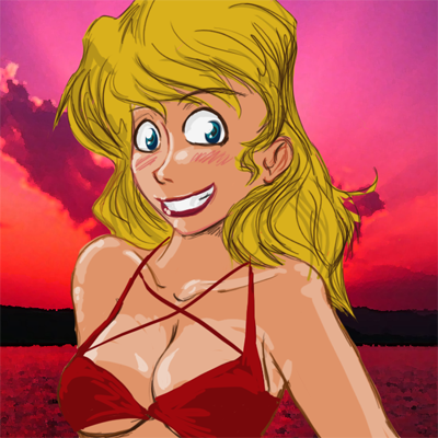
i think your coloring is actually superior here when it comes to the skin tone in comparison to your comic stuff, but i really don’t like the style too much, plus usual back of the head is too small and she looks like she’s balding on the right side. :P guidelines are your friend, i tell ya’!
I definitely like this style. About the only criticism I can offer is that the highlights on the breasts seem a little off.
Also, her expression makes me think that she’d like to chop my head off with a hacksaw, but that could just stem from my phobia of blonde girls in bikinis.
Iono, she’s a little too ‘plastic and bleach blonde’ looking for my tastes. What I basically did was blob down a stick figure, add highlights, and then zoom in close to add details in darker tones of the around it, as opposed to my usual tack of messy, thick scribbling lines.
I didn’t use any black in this! This may be a relief to anyone who doesn’t like the newer RK pages’ style.
The extra highlight make a lot of difference, and help make the image look more detailed and ‘shiny’. The lack of black outlines also helps making the image look ‘soft’. I think this style is appealing. I approve.
Also, she’s hot, draw more like that. Draw one of those a day and your site’s traffick will multiply tenfold.