Since I’m kind of arting with a less than optimal setup (stop miming a tiny violin at me damn it), I thought hey, why not take a day to break down what my typical process for drawing actually is? I’m not saying this is going to be an amazing, eye opening tutorial, but I’ve learned a lot reading how other people do things, and maybe someone reading this will pick up a trick or two as well.
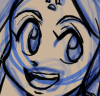
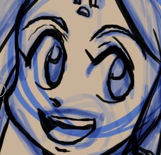
 Typically, I start with a sketch of varying roughness, whether done on the tablet or scanned from actual pencils, depending on the mood I’m in. Some nights, paper just feels better! If I’m doing it on the computer I usually use a colored ‘pencil’ so I don’t get lost inking. At right, for kicks, is a little trick I’ve been using when drawing heads. It’s pretty easy to draw a minimalistic ball-head with dot eyes, which are a guide that helps me estimate the ‘center point’ of each eye so I can go over it a second time and detail the eyelids, actual iris placement, so on. Doing it that way has been a quick and easy way to help drawing the head at different angles, which is great since I’m trying to make more interesting poses.
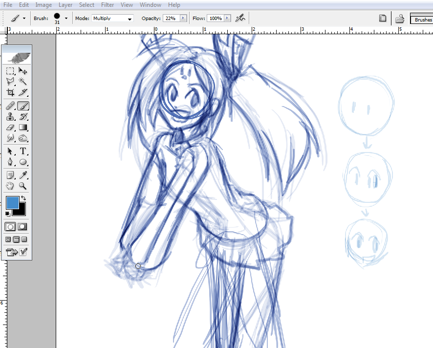
Another trick I’ve been using when having trouble with posing is to use a thick brush to draw what amounts to a chunky stick figure, building on top of it gradually to help figure out where everything should go. I didn’t use it on today’s drawing, but I probably should have on the hands since I was trying for a needlessly tricky interlocked-fingers thing.
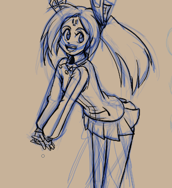
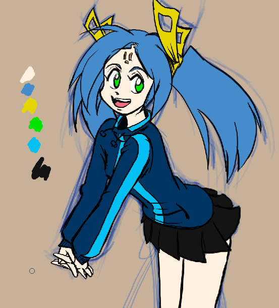
Once I like a sketch (or sometimes from the start) I toss up a background color, something I don’t plan to use within the drawing itself so that when I get around to coloring, I don’t miss any spots. I’m kind of picky about my inking- I like clean, sharp, manga-ey lines, but I also like them a little on the thick side. SAI has been wonderful for inking my stuff, but it doesn’t seem to want to work right with my backup Wacom, so I’ve been having to do it in Photoshop and the lack of a stabilizer function is *killing me.* (see right.) This is a good reason to work as big as you can stand! The wobble is a lot less evident when I export something at 500px wide.
I don’t use the fill bucket or selection tools very often when I color. Not sure why not, I guess I just like the feel of coloring the line art in ‘for real.’ It’s not a bad idea to leave splats of each base color off to the side, especially if you’re doing more of a painterly approach and don’t want to lose that original color or are working across computers. Of course, since I draw Eishi all the time, her and Dixie’s palettes are already added to my Photoshop swatches.
Also, I put all my flat color on one layer which statistically must piss off somebody out there. If I need to use a filter/texture/pattern fill though, I start a new layer with a ‘chroma key’ area masked out. Basically when I go full color, I try to make sure my base color layer(s) keep the background from poking through uninvited and the colors stay consistent, especially in a comic strip.
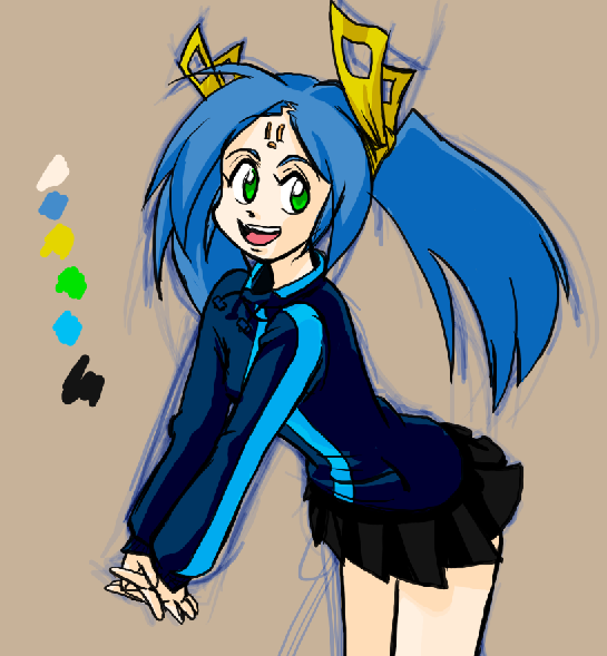
When I shade, I find myself alternating between multiply and color burn layers depending on if that part feels like it should be getting more intense or just darker. (Skin usually looks better with burn.) I’m finally getting away from using neutral greyscale shading in favor of browns or blues for the most part, like I had a delayed reaction to my fine arts lecturers or something. Sometimes if I’m being lazy or in a hurry to post a comic I just do this basic shading and go ahead to toss it up. *ahem*
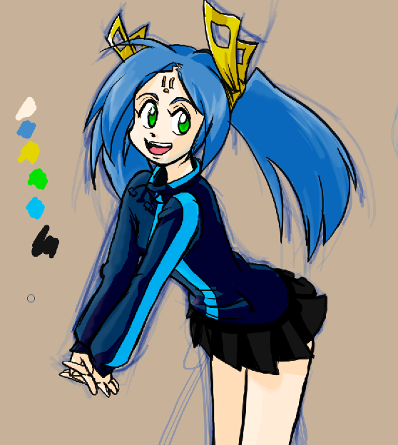
Once done shading, naturally you add highlights to make things pop! I usually use straight up white and play with the opacity until it looks alright. For this pic I wound up smoothing the highlights out, looks kinda nice.

Lastly come what I like to call my “slop layers.” If a picture looks like it should be a little darker, a little warmer, or whatever, I just ctrl+click the flat color layer so the character’s area is selected and start building up more tones, color adjustments or highlights.In this case, softened the shading up with some blended browns and a little tiny bit of blue ‘glow’ since he stripes on Eishi’s pullover are really bright.
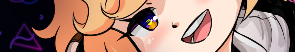
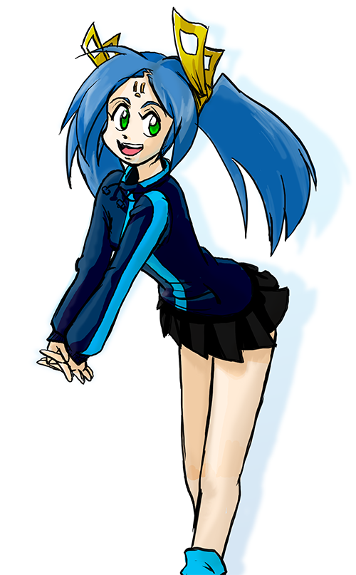 Tadah! It’s Eishi! What, I cropped her feet? I’m not bringing in foot-drawing money doing this, you know!