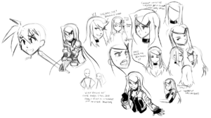
 So, been a while. Been flogging myself back into productivity slowly but surely, and thought I’d touch on a bit of the thought behind Dixie’s character design to accompany some doodles I did this evening.
Dixie actually sprung more or less fully formed from the start. She was more or less designed as a ‘foil’ to Eishi in both personality and looks. Eishi’s small, round-faced, wide eyed and wearing loose, soft looking clothes, whereas Dixie’s features are sharper, and she’s about a head taller and dressed in tighter, tougher biker wear. One of the biggest influences on her look was probably Priss from Bubblegum Crisis 2040, though not intentionally. I just kind of noticed they had really similar outfits on a rewatch.
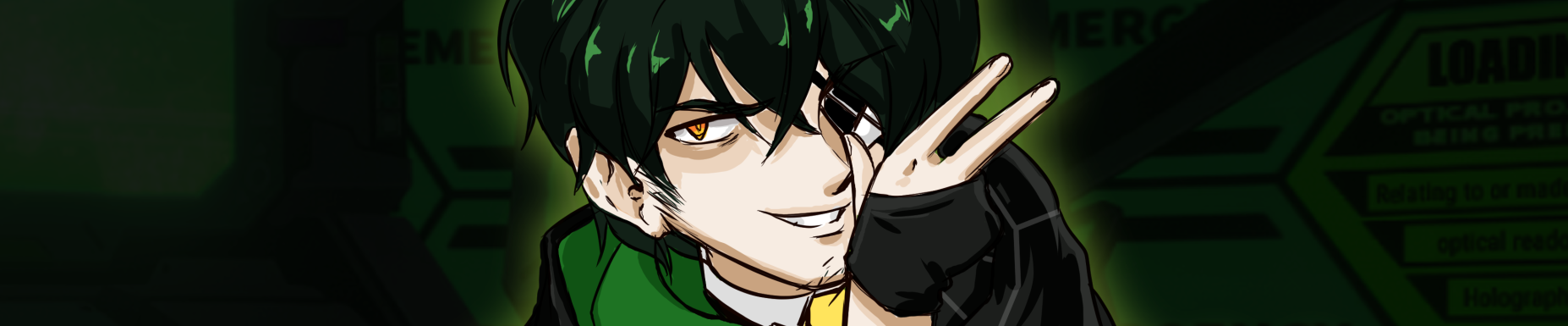
Her main change since the start of the comic (other than trading her red jacket for a black one on occasion) has been a series of tweaks to her hairstyle to smooth it out a bit. The low battery hair clip has been a constant from the start, but under the newer looks it’s actually more ‘functional’ by pinning her hair off to the side more visibly instead of just being a decoration hanging off her bangs. I also adopted her orange eyes from a drawing of the girls my friend Dani did for me- her original eye color was bright red but with her hair and jacket it was kind of overwhelming.
I think the next time I play with her design a key goal is going to be to spread her colors out more evenly. I was pretty fond of her ‘idol’ getup from the strip where she was actually happy to be reviewing a JRPG. She’s always fun to draw, though. I really love drawing characters with irritated or blase expressions.